Performance+ Notifications
Identifying user expectations for notifications in the Performance+ app and the content needed to guide next steps.

Product
Honeywell, Performance Plus (+)
Platform
Web app
TL;DR
Overview
The Honeywell Forge product, Performance Plus, is software used to monitor assets and operations for sites like warehouses and manufacturing plants. In usability testing, it was discovered that users miss notifications that appear in the stationary right panel.
This can cause dangerous issues if there are urgent notifications, such as if a piece of equipment fails or a worker gets hurt.
Role
UX research lead
Completion
January 2024
Problem statement
The notifications panel in the Honeywell Forge product, Performance Plus, is insufficient in gaining user's attention, and they are unable to find need-to-know information on items, such as work orders or incident reports.
There is a need to uncover how Honeywell Forge products can provide effective notifications to support user's tasks.
Goals
Validate user expectations of the presentation of different notification types
Identify the content needed per notification type (I.E., snack-bar)
Understand the next steps a user would take per notification
Approach
Methodology
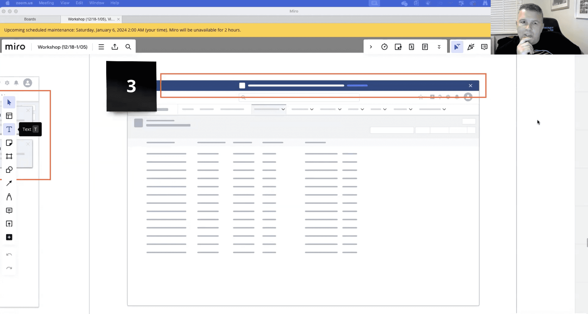
60-minute, one-on-one interviews to conduct three activities with each participant in Miro:
Describe each notification presentation
Match a notification message with the expected presentation(s)
Describe the content needed within the message and presentation
Participants
I interviewed 6 participants from UserTesting.com's participant pool:
3 of 6 worked in a distribution center or warehouse
3 of 6 worked in a industrial center or refinery mill
Participant job titles:
4 of 6 participants had managerial-focused roles (I.E., Maintenance Manager)
2 of 6 participants had task-focused roles (I.E., Technician)
Stimuli
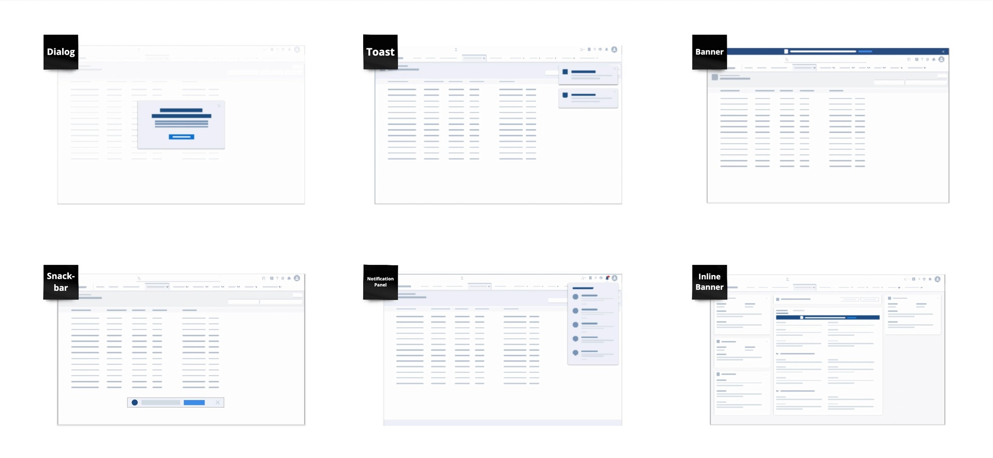
I. Visuals for notification presentation
Participants were asked to describe the six notification presentations:
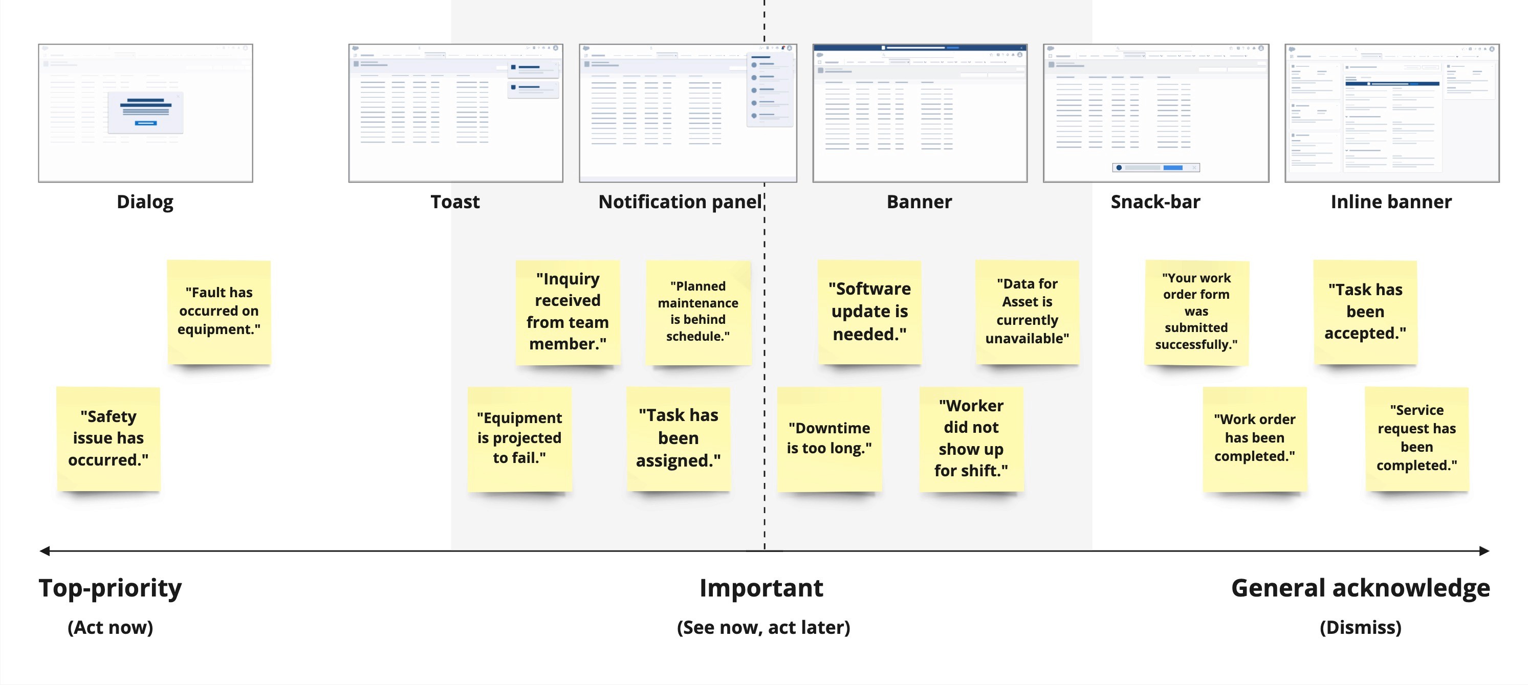
Dialog, Toast, Notification panel, Banner, Snackbar, Inline banner
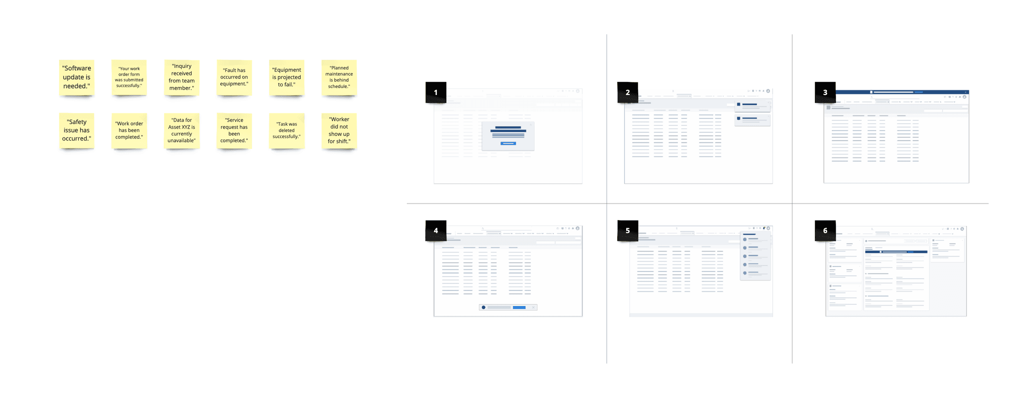
II. Messages for notification content
Messages were selected from notifications in the Performance Plus product. The messages shown to participants depended on if their role was managerial or tactical.
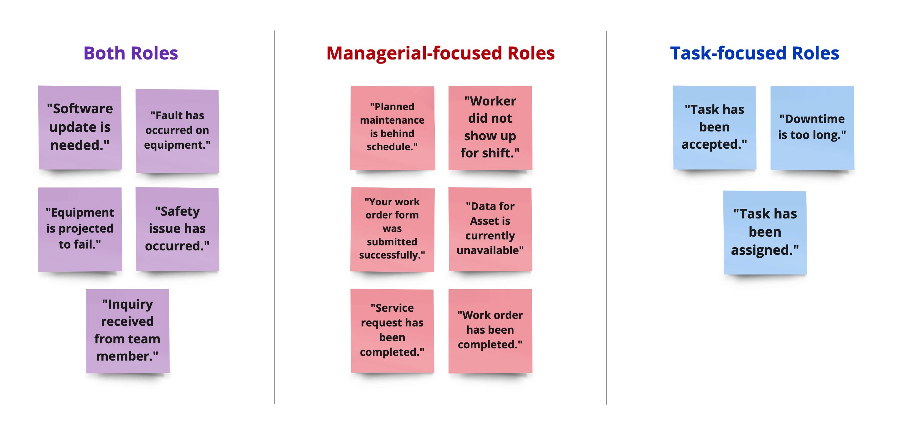
All participants were shown messages that applied to both roles, such as "Equipment is projected to fail."
Managerial-focused roles were shown strategic messages, such as "Planned maintenance is behind schedule."
Task-focused roles were shown tactical messages, such as "Task has been assigned."
Findings
Users expect the ability to snooze non-urgent notifications
Notification types can be integrated for the same message
Users want options to act directly on notifications
Offline = Missing notifications
Users expect the ability to snooze non-urgent notifications
5 of 6 participants mentioned using 'snooze' or remind them later for notifications they perceive as non-urgent.
“I can choose to approve (a request) or do it later… I can just click on snooze if I’m too busy to look at that at the moment… Snooze for one hour then I can go back and check that.”
-P1, Inbound Area Manager, Warehouses (Managerial-focused)
Notification types can be integrated for the same message
6 of 6 participants expected reminder notifications to appear as a different type or expected to find the message again in their notifications center.
“I would want (toast) in the (notification panel) because maybe I’m busy when the (toast) came. But I can check the red button (bell icon) and I’ll click it.”
–P3, Maintenance Manager, Industrials (Managerial-focused)
Users want options to act directly on notifications
5 of 6 participants expected to take certain actions directly from the notification, such as "Share" and "Assign."
”I can have ‘Go to details’ (CTA) of last maintenance if there’s a dashboard available… then there would be actions like ‘Call the OME or technician’.”
-P1, Inbound Area Manager, Warehouses (Managerial-focused)
Offline = Missing notifications
5 of 6 participants described experiences of being offline & away from their PC to address other responsibilities—missing notifications.
“If I get a notification to actually go to a job, to get to the job is up to a 10-minute walk… I would say we complete most jobs in about an hour… WhatsApp (through mobile phone) tends to be for more urgent jobs (if already at a job).
-P5, Maintenance Engineer, Industrials (Task-focused)
Key insights
Perceived urgency directs the display of the notification
Content needed in notifications
Perceived urgency directs the display of the notification
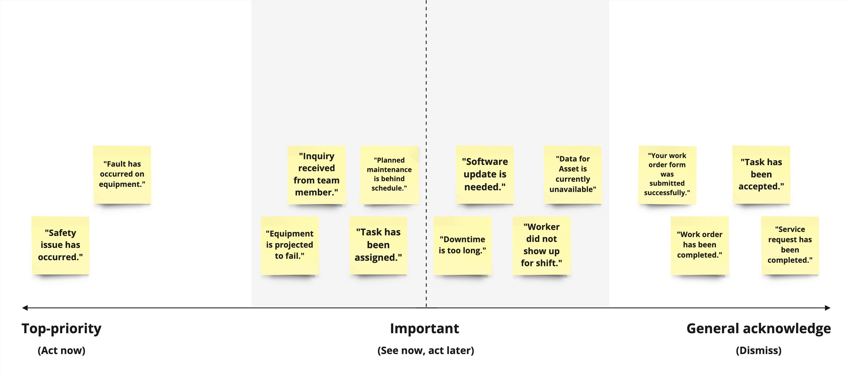
Users discern messages by being top-priority, important, or general acknowledgement.
Top-priority: Users will drop what they’re doing to attend to urgent messages
Important: Good to see now, but will need to be prioritized to act on later
General acknowledgement: Valued by users to receive confirmation, but no next steps are needed
Perceived urgency of the notification determines how the user expects the notification to present on their screen.
Top-priority: Users prefer to be disrupted with a dialog notification
Important: Users prefer less disruptive notifications that still makes them aware, such as the toast
General acknowledgement: Users prefer discreet notification types so they aren't distracted, such as the snack-bar
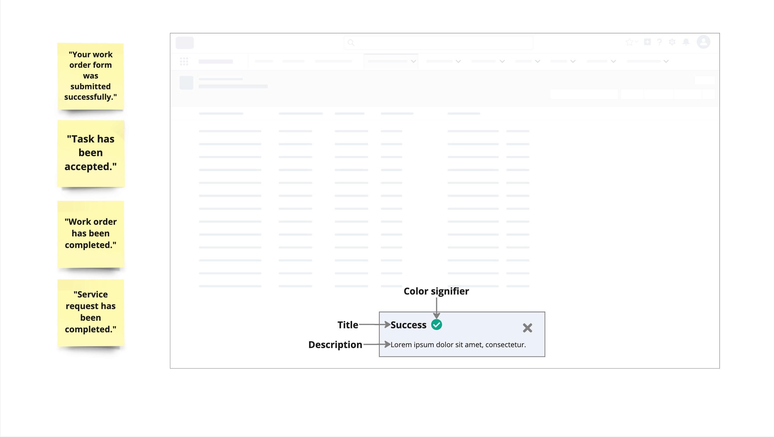
Content needed in notifications
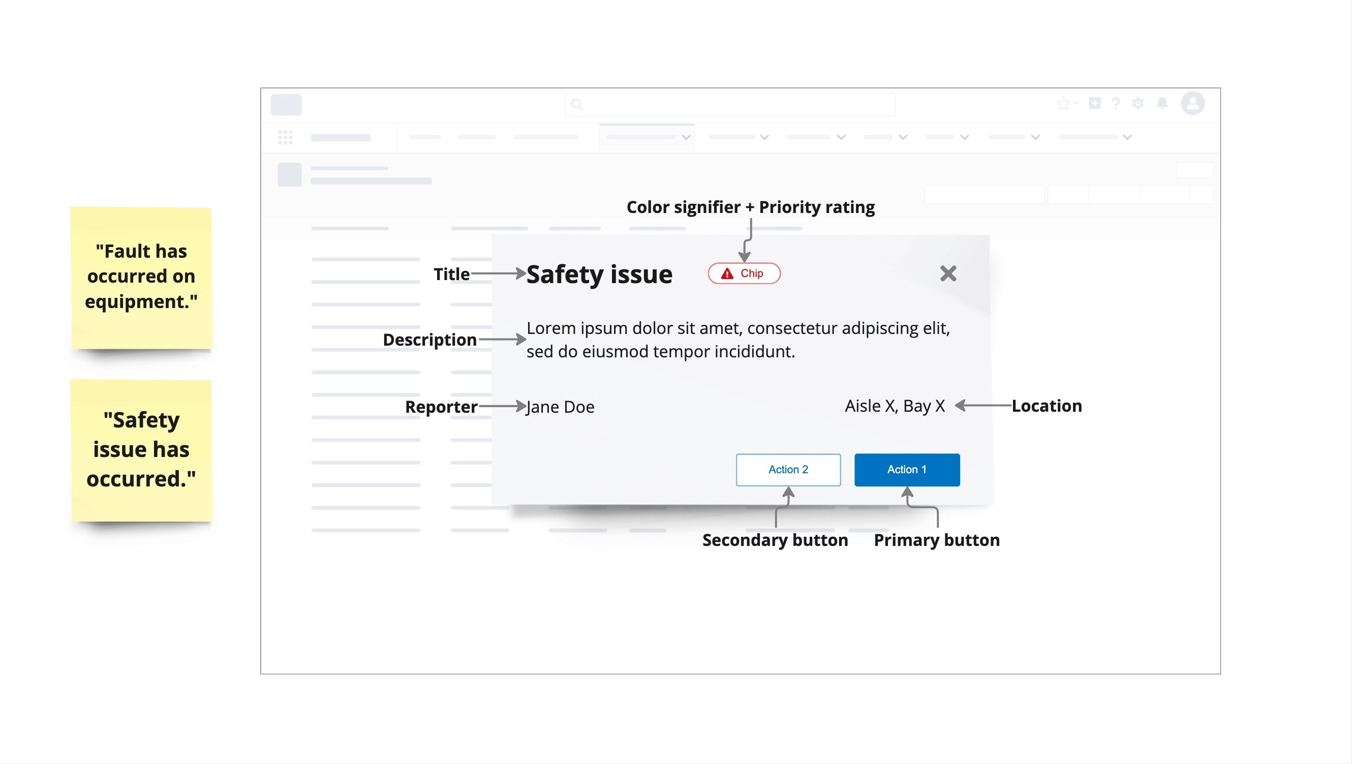
Top-priority messages: Users need detailed information and call to actions for to allow users to address their next actions ASAP.
Participants valued a priority rating, description, location, reporter's name, and color signifier
Possible CTAs: "Call for help," "Contact reporter," "View equipment"
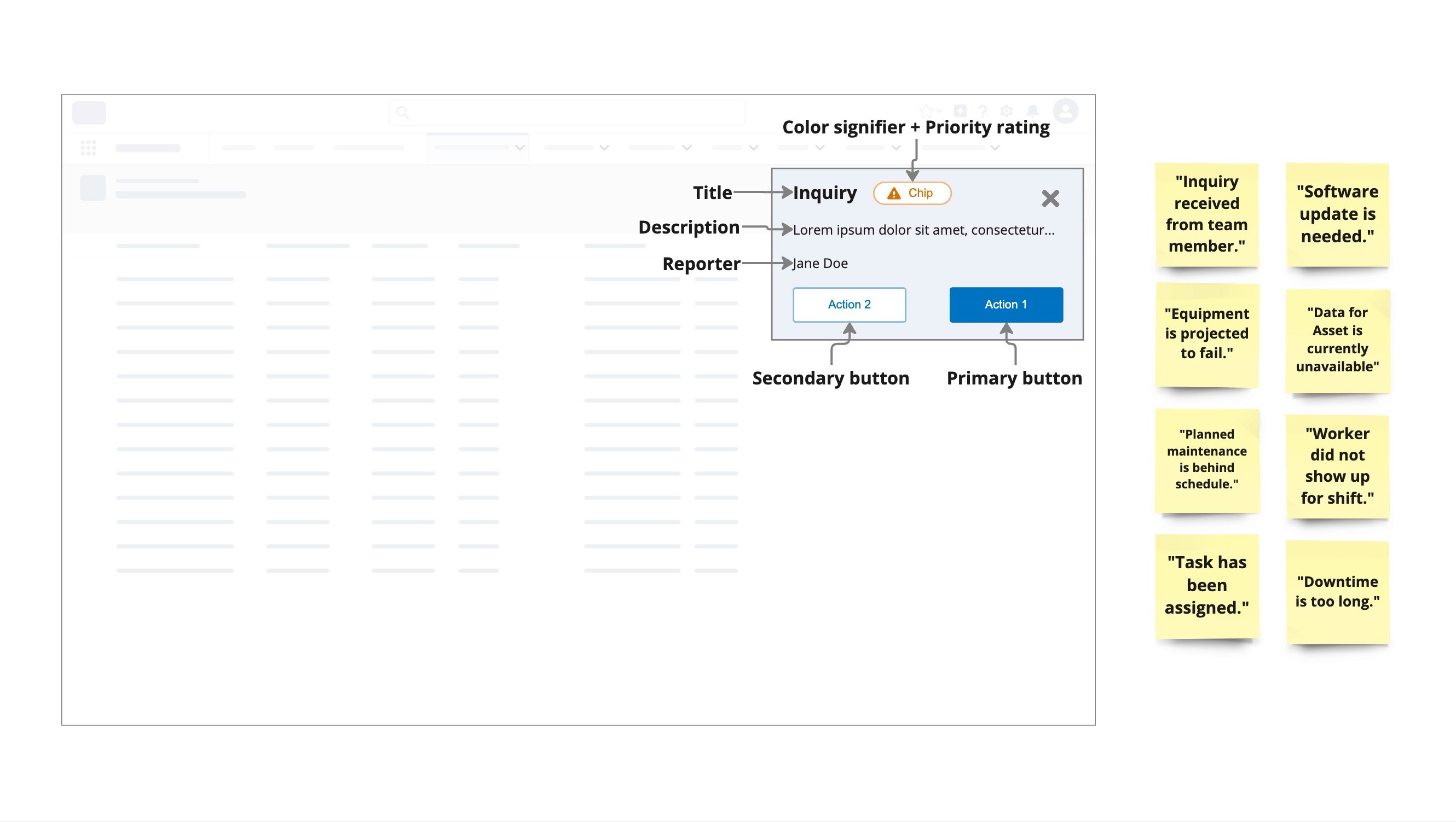
Important messages: Users need some information and call to actions for important messages to give users a digestible version of the notification in smaller presentations like the toast or notification panel.
Users value a title, preview, priority rating, and reporter's name
Possible CTAs: "Snooze," "Assign," "Share"
General acknowledgement messages: Less information and call to actions are needed for acknowledgement messages that are likely to be dismissed by the user.
Users value a title, description, and color signifier
Possible CTAs: "View details", "Download", "Dismiss"
Conclusion
Synthesis in Dovetail
This was my first research study that I synthesized in Dovetail. I was able to upload my UserTesting interviews into Dovetail to generate transcripts. I used the transcripts to tag participant quotes to create groups and themes.
Guidance for UI components usage
This research gave direction for the Forge UI Design System notifications pattern. The pattern maintains consistency across Honeywell Forge products by using the same UI components (toast or banner) for the same type of message.