Forge UI 2.0 Launch
Building Forge UI version 2.0, Honeywell software's official design system.

Product
Honeywell, Forge UI Design System
Platform
Web app
TL;DR
Overview
Forge UI is the official design system for Honeywell Connected Enterprises, and is used in the context of enterprise software (I.E., Asset Management) for distribution centers, buildings, and manufacturing plants.
Role
UX designer
Completion
October 2023
Problem statement
The Forge UI Design System team is experiencing file size issues in Figma, disparities between Figma and Storybook UI components, and designers not applying design system updates.
Before the new version of Forge UI is launched, the design system's Figma file structure, Storybook UI components, and communications channels need to be updated to enhance the sustainability of Forge UI's components and usage with our UX adopters.
Goals
Identify areas for improvement from designers who adopt Forge UI
Create a scalable design system file strategy in Figma
Enhance parity between Figma design and Storybook code
Create a version control strategy for Figma updates
Research
The Forge UI Design System supports Honeywell Forge's software between multiple business units (I.E., Connected Buildings and Industrials). I needed to better understand how our UX adopters use Forge UI and identify any pain-points they're experiencing while using the current version of Forge UI.
Approach
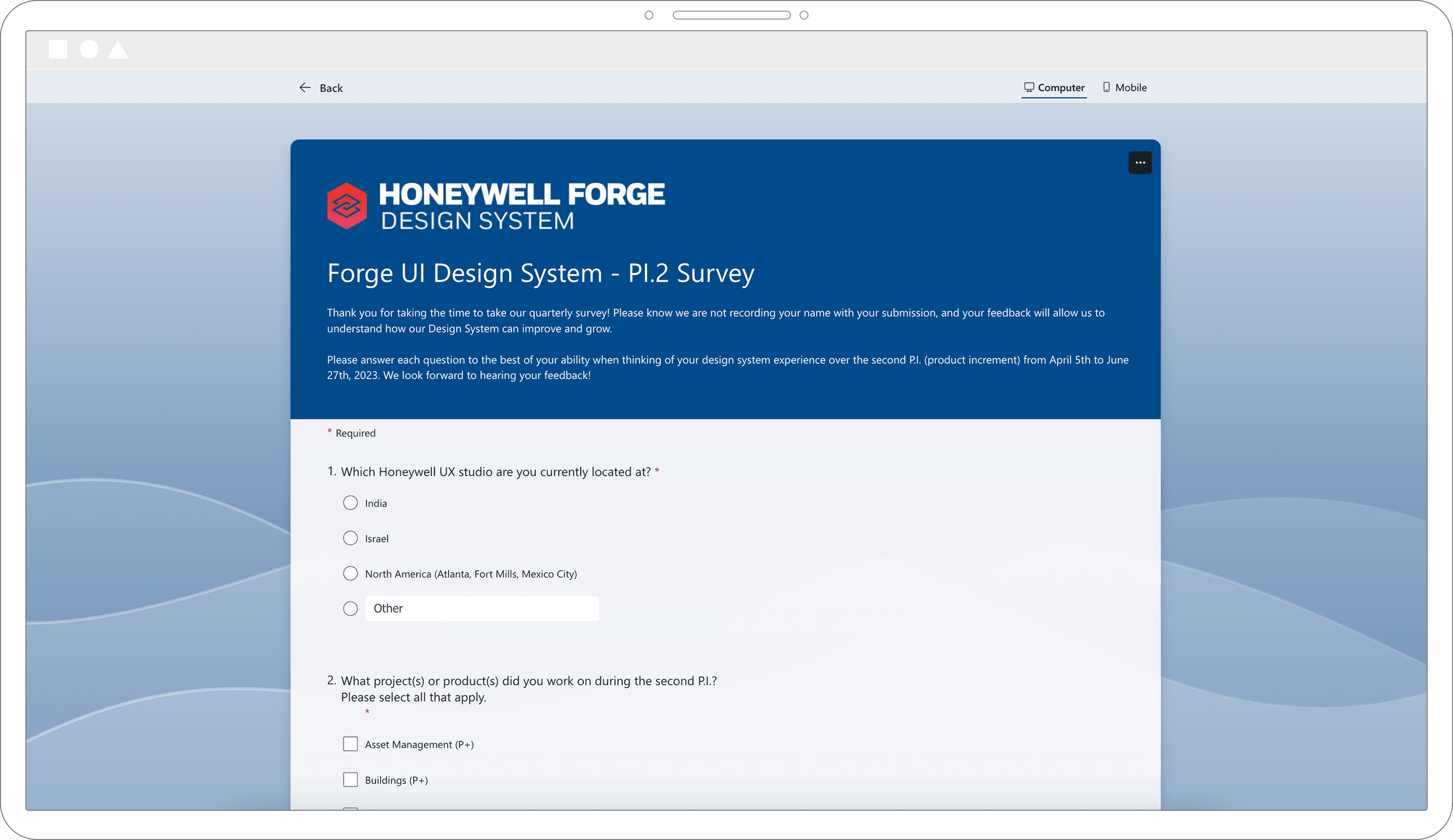
Methodology: Survey (open and closed questions)
Participants: 23 total
Stimuli: Microsoft Forms sent directly to each individual designer
Research insights
Design system Figma updates are overwhelming for designers to review—causing hesitancy to adopt changes.
The Net Promotor Score (NPS) for the design system's documentation was negative (-5 out of 100)—indicating an area to improve how designers can review specs of UI components.
The most detached UI components were the "Card" and "Data table"—indicating Forge UI needs to refresh the components to reduce detachments.

Opportunities
Figma Files: Memory issues with 1.0 Forge UI Design System structure
Code Parity: Lack of parity between Figma and Storybook components
Versioning: No version control with 1.0 Forge UI Design System

Figma files
❌ What was contributing to the Figma file memory?
Too many UI components in one file
Hidden layers in the master UI components
"Nested components" included in the main library
Omni-complex UI components
Near duplicate UI components
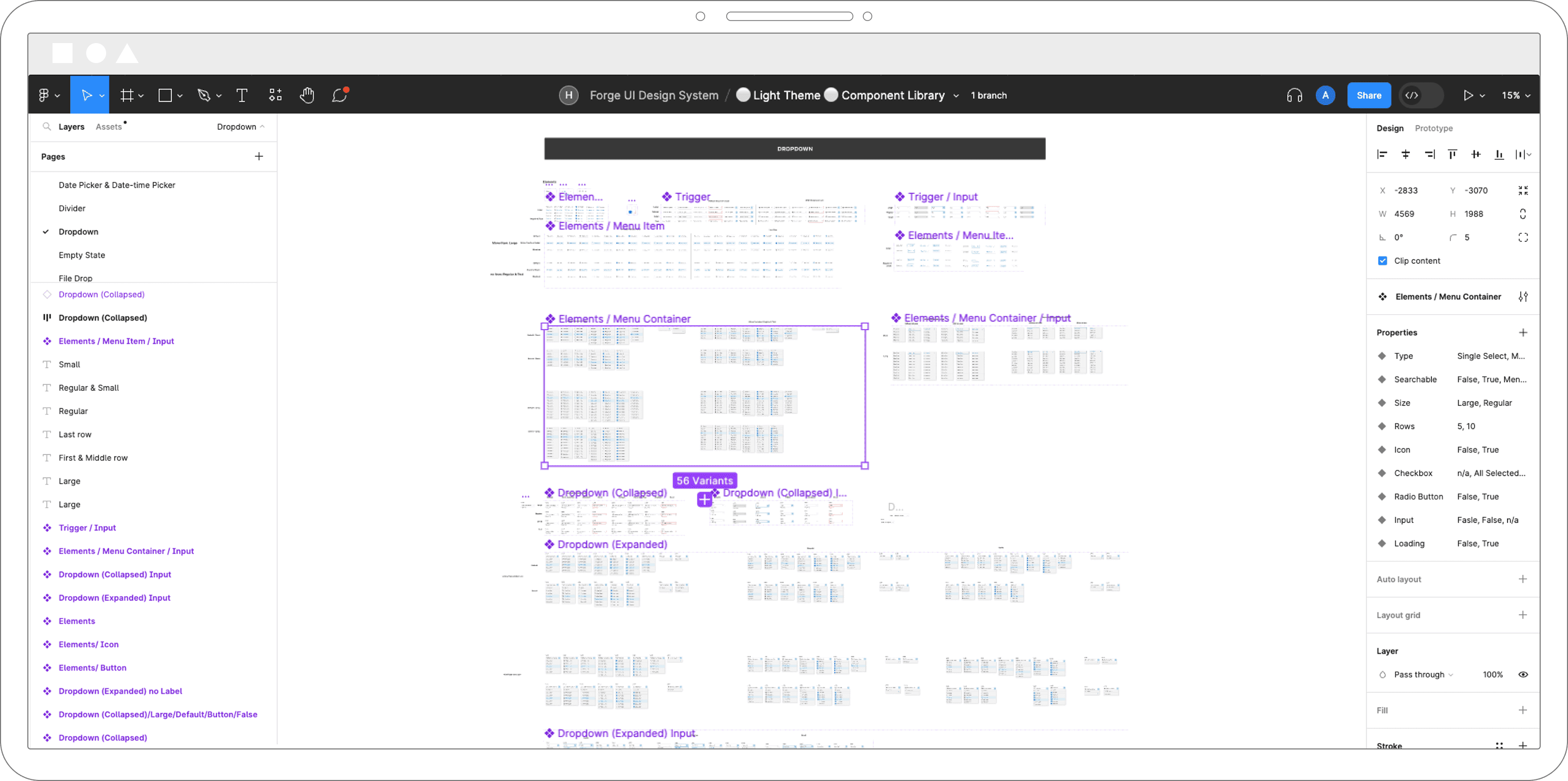
✅ Fixing each Figma issue
Split the design system into related chunks (I.E. Data visualizations)
Audit and delete all hidden layers in UI components
Create a "Nested Elements" Figma file
Break up large, complex UI components into multiple components
Combine near duplicate UI components using Figma properties

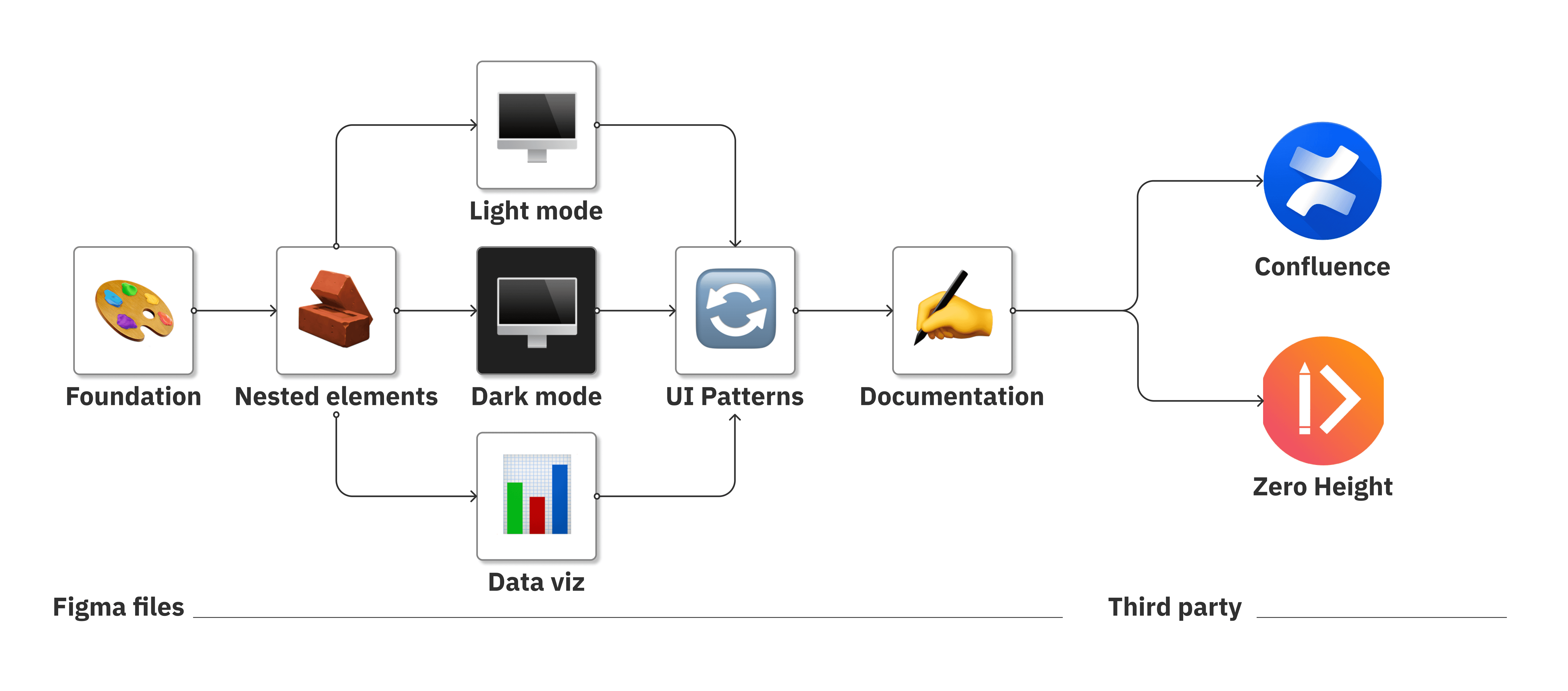
2.0 Figma file structure
The new design system structure follows Brad Frost's Atomic Design approach; starting with small atoms to build into complex organisms. Design system documentation is then housed in third-party apps like Confluence.
Key takeaways - Figma files
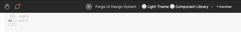
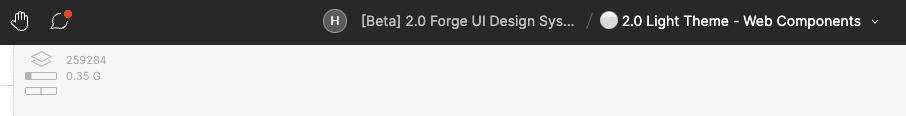
Light Theme Component file's memory decreased from 0.87GB to 0.35GB
File memory before
File memory after
UI components perform faster in Figma and are easier to modify

Action menu before

Action menu after
Code parity
❌ Design and code are not one-to-one
Design tokens aren't consistent between Figma and Storybook
Inconsistent property (or control) naming across design and code
UI components supported in Figma do not have Storybook counterpart

✅ Improve consistency between design and code
Collaborate with UI engineers to create a design token nomenclature
UI components in Figma given component APIs to match Storybook
Status indicators added to Figma to show code-ready components

Key takeaway - Code parity
Improved communication with UI engineers and design system adopters

Status indicators next to UI components

Status indicator meanings
Versioning
❌ Design system has no release cadence
Unscheduled design system releases create roadblocks to adopters
No version control causes conflict between design and code
No publication description with each Figma update

✅ Establish a release cadence
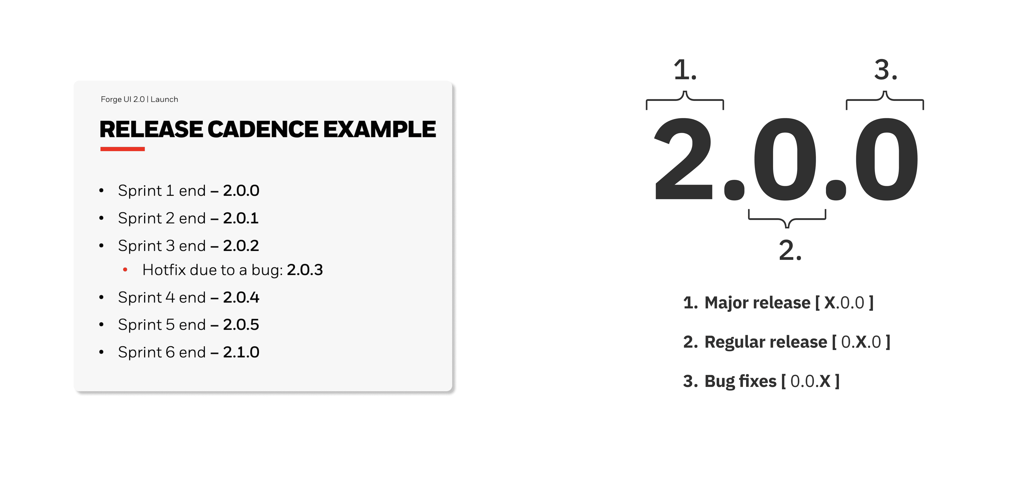
Align design system updates with product increment (P.I.) calendar
Use semantic naming with version control
Maintain a design system change-log for version history
Key takeaway - Versioning
Version control improves design system consistency in product designs

Change-log in Figma
Conclusion
Here's to the 2.0 Forge UI Design System
This project was tedious in finding resources to help form the right strategy for the new version of the design system. It was rewarding to see what causes the nuances of Figma file memory issues, as well as what works well for other design systems.